Bolt
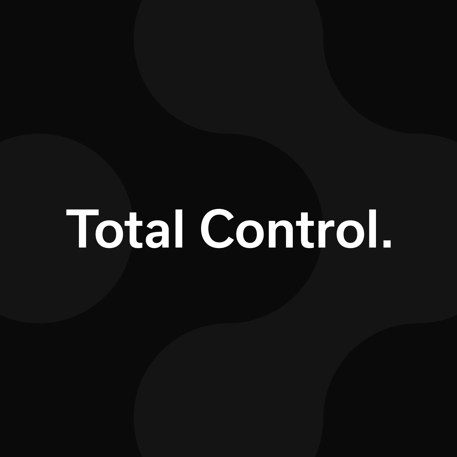
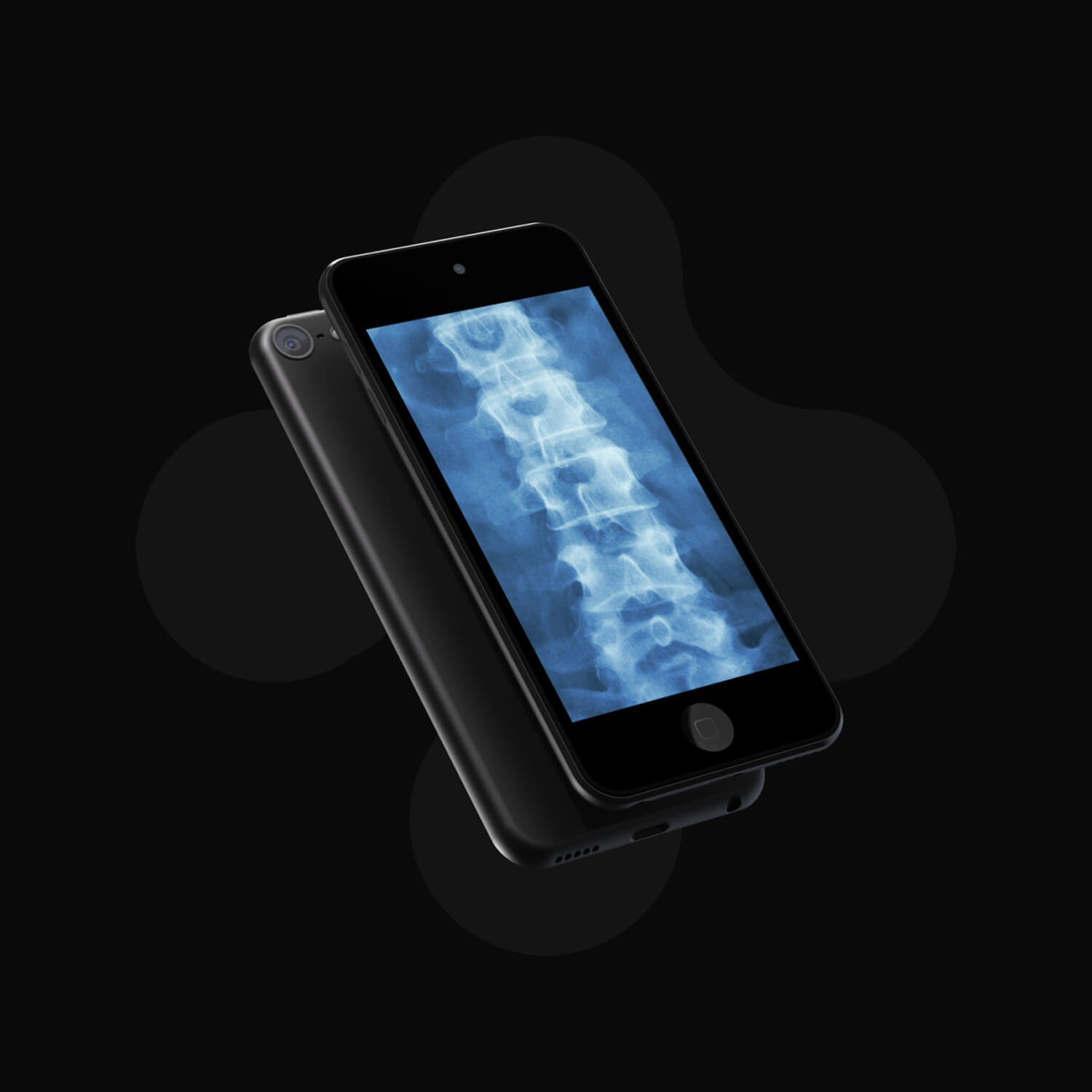
Bolt is a disruptive surgical navigation system that gives surgeons total control in the operation room. To bring the product to market, the team needed a name, visual identity, and microsite that could communicate both the value of the product and the story behind it.
Strategy · Logo · Identity · UX/UI – Designed at 829
Visual Identity
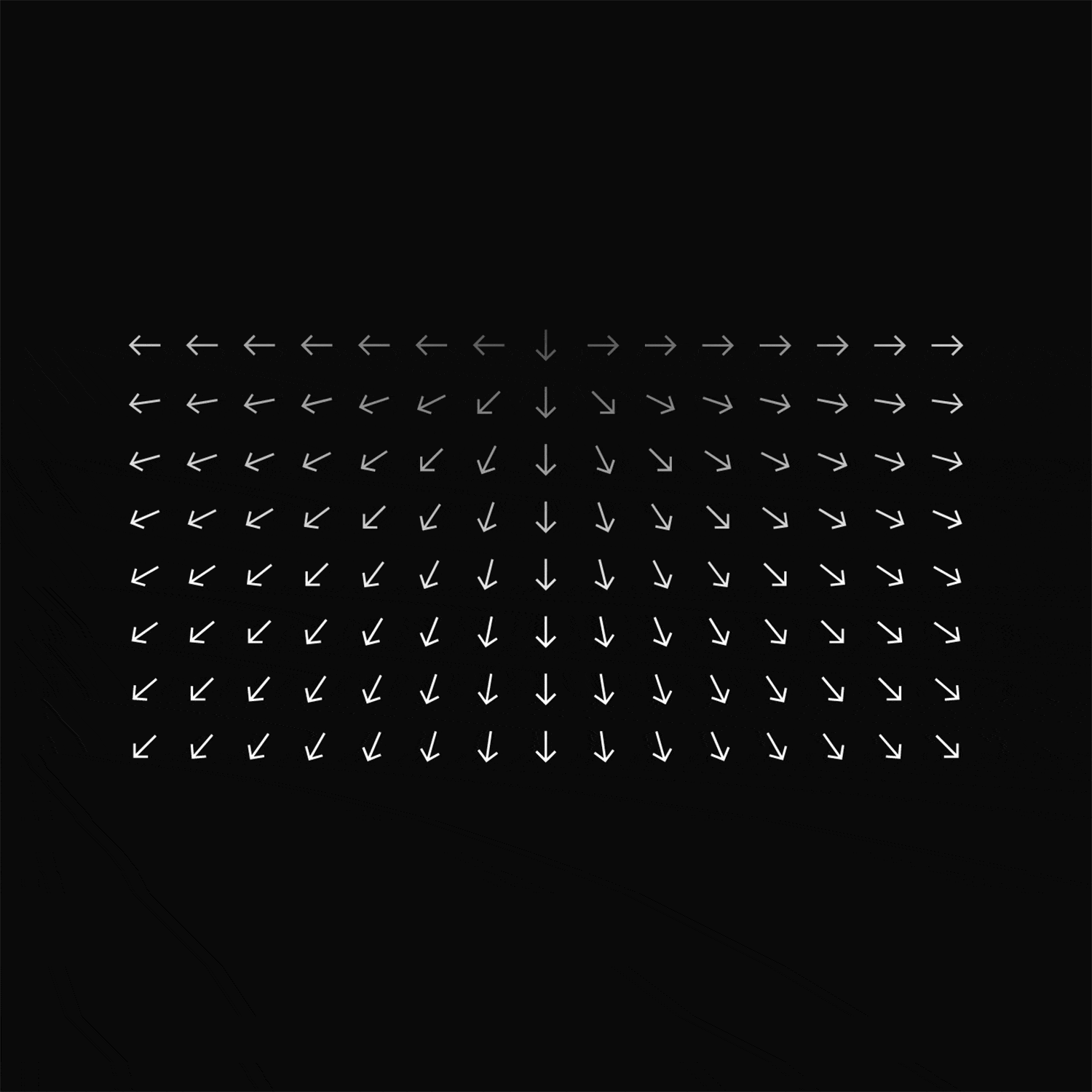
A minimalist mark inspired by navigation and the spine defines the system, paired with surgical blue and precise sans-serif type to signal confidence and attract investors.
Digital Experience
The design system embraces clean layouts with curated visuals and messaging — an intentional approach for a startup launching with limited assets.